Sunday, October 31, 2010

T.K. Midterm project

http://sws.pcc.edu/student/CAS175_pdeangel_44402/kelvenjones94/MidtermProject/midtermcs4.swf
LAYERS
I used 8 layers for my project and the library has 2 folders

DRAWING OBJECTS
I drew the moon and made the pumpkin in photoshop. I just find photoshop easier for those kind of tasks.

SYMBOLS
I turned my moon into a symbol and converted my png files from photoshop into symbols. I am trying to get better at drawing things inside of flash but as of now I suck.

SHAPE TWEEN
I used a shape tween on the scary face that comes out of the pumpkin. I made it go from small to full size as it traveled

CLASSIC TWEEN
I used this on the rabbit which was the simplest thing to do to have it hopping like I wanted to. I also used it on the scary face to create the path it followed.

MOTION TWEEN
Now i played with the moon by putting a color ease and a motion preset to make the pulsating motion effect. also used it on the pumpkin top which i made shoot off the screen with a blur to it. The scary face changes color as it travels and also spins 360 degrees. I used the particle system for the confetti coming out of the pumpkin.


overall this was an okay assignment. I had the most difficulty coming up with what i wanted to make the movie about and was blank but this ended up being the idea that popped up.sorry im rushing to write this and its not super in depth but just wanted to get something up and explain a few parts.


Saturday, October 30, 2010

Midterm_David Peterson

Midterm_David Peterson

Thoughts and comments

I truly enjoyed this piece that I did mainly because it was a true challenge had to work very hard with little time to be able to create this image but most of all I truly enjoyed creating the meteorite smashing to the tree it was a neat effect and visually beautiful


Process of creation

The first begin by creating the background using two different square shapes and merge them together then I bound them together to ensure it was one solid whole after I created the background I decided to then copy the Humpty Dumpty tree from project two and paste it into my new background after I had done this I created the shapes of the leaves on the tips of the tree using the primitive oval tool by shrinking its properties down to the correct size and grouping several and positioning using the free forming tool
after I finished creating the tree I then created the stars by copy and pasting again from my Humpty Dumpty pitcher and then attached a classic tween to it to give the movement soon appears to be a collection of shooting stars I then created the sun and the moon and added a motion tween to the sun alongside with an ease and alpha effect so it appears to come in faded and slow then to blend into normalcy then back into fading as it goes off screen and then created the moon using the primitive oval tool and shrinking
its properties down to crescent shape and colored it to a light pale yellow and added a frame by frame animation to the moon as it appears to go left to right just like the sun I then created a meteorite inside the sky by creating it with the oval tool and colored it a darker brown and turned it into a symbol as a got bigger with flames attached to it after I created this I then created a new symbol of the meteorite smashing into the tree.
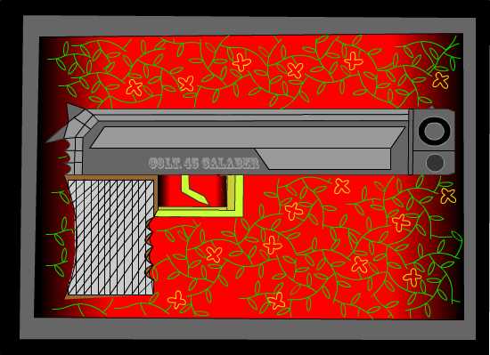
I then created a fire symbol and created it as a frame by frame animation by setting the fire at a different angle in each frame and cutting at different holes within the flame to give it a flickering effect I then set it onto a new layer and placed it over the broken tree stump giving us the the effect of the tree stump on fire I then used the pen tool and created an alien and his gun and made him into a symbol that attached a motion tween to make him look left and right and then walk off the street I did this
by adding different key frames and two different symbols of alien by reversing one then attaching each to a different key frame side-by-side giving the appearance of looking left and right.

Story boarding

i) List hexadecimal Colors

I used in Kuler the selection A lot OF Blue and more of the basic colors on the left;
618DD0, 1B4B94, 2565C7, 663300, 00CC99, 00FF00, 000066, FFFFCD and FF0000

Symbols

The tree and the stars are both symbols from my Humpty Dumpty project two piece. I modified the tree so that it had base and it had texture upon the bottom to give it a more realistic looking style along with leaves on the top

Classic tween

Classic tween was used for this because I found it an easy and effective way to create a cluster of shooting stars because they are only moving in one direction so shape tween was not needed nor was motion tween because both are more complicated

Second tween

I used the preset smoke because it allowed the fire I created to have a more realistic look to it

Motion tween of my choice

The motion tween I chose was for a broken piece of the tree flying through the air and smacking upon the ground then bouncing closer to its stump the reason for this was to give the effect of impact from the meteorite smashing into the tree

First tween
the process for the Suns creation was using the oval tool and creating a circle that was yellow then creating it into a symbol then creating a motion tween and having it move from left to right off the screen I also used alpha effect to make the sun go in and out those creating the passing of daylight I also used ease to slow the Suns speed

Second tween

I created smoke by creating a square box shape then I turned into a symbol and sliced the edges off with the erase tool thinning it out thus creating a more smoke like look I then added the motion preset smoke and set it over the fire on a separate layer

Third tween

I recopied the Humpty Dumpty tree and created it into a symbol then cut off the top and bottom put it onto a separate layer and integrated it into a motion tween I then made the tree flip using the motion tween and key frames I did frame by frame different pictures and made it appear to bounce off the ground and land flatly

Midterm - Amy Petit

I was having trouble posting my video so I'm linking to it here:
sws.pcc.edu/student/CAS175_pdeangel_44402/amypetit41/MidtermProject/

For this project I decided to use a three act show to incorporate all of the different animations. I used the a color theme I got from Kuler as the main palette - hexidecimal numbers A61103 (red), F24405 (orange), F28609 (lt orange), F2CE3E (yellow), 496D8C (blue). I used separate layers for the act signs so that I could treat them as separate motion tweens. I also separated out the curtains, cat, fish, fish bowl and birds so it would be easier to create those tweens and named them accordingly. I used folders for the act signs and the birds to keep them organized. I used a combination of primitive objects (diving board), merged objects (the fish and fishbowl) and object drawing (the cat and bird shapes). The pen tool was useful in creating new bird shapes and modifying the bezier curves. In the library I have about 20 symbols that are named and put into folders. They consist of the different parts for the bird, cat, curtain and act signs. I reused portions of my cat animation from project 3. I duplicated a grouped bunch of cat pieces and modified it to be the two symbols I needed for the cat dancing. The curtain opening and closing is the frame-by-frame animation. The fish jumping into the fishbowl is the shape tween and it is distorted by straightening out and changing color. I used an ease to slow down the motion of the fish and added a little frame-by-frame for the bubbles. The classic tween is the cat dancing across the stage. I felt that a classic tween was appropriate here because I could insert keyframes into the tween that changed the symbol – that make him look like he was dancing. For the three simple motion tweens – I used motion tweens for each one of the birds. The first flys in and alternates color. I used the motion editor to change the color and to apply a sine wave ease. The second bird also flys in, changes color and uses a bounce in ease. My objective with these tweens were to make them look like they were jumping all over the screen. The third bird is a motion tween with an alpha applied coming into full view as it gets closer. It then flaps it’s wings using frame-by-frame and flys off using another motion tween. The act signs are also controlled using motion tweens and slow eases. Overall I felt like this was very challenging but useful in that I’m learning more about the motion editor and how to make it work for what I want to do.


Friday, October 29, 2010

PS - Project 3

I used a Shape Tween to turn the heart into a ball and then later for the ball back to a heart to start over. I used a Classic Tween for the ball bounce. I used a Motion Tween for the rocking moon and for the ball loop. The rocking moon rotates. The ball loop has a path and also a "bounce" preset.

I like the morph effects of the Shape Tween. For the Motion Tweens, I like that you use symbols and can swap symbols--that helped me switch out my shapes with ease. Having an organized library helped with the swap process as well.

My favorite part of this little movie** is the dancing feet on the big red heart! :)


**I wasn't able to upload the .swf file - I gave up after it was processing for more than 1 hour!!

Saturday, October 23, 2010

Project 3 Kirandip Kaur


Hi class , here is my project 3 animated flash on Halloween theme.I am feeling that I have crowded the movie......
1. Classic tween is used for the vine and pumpkin , they are made in that .

2. Shape tween is given to the moon which changes its color effect with move and at the end changes shape too.

3 The bat and ghost are in motion tween , bat has given motion preset bit changed because that was too small path for move , ghost motion is created by me , transform is used for both , rotation and color effect is changed to tint , red for bat.

4 I the motion editor easing is changed for both bat and ghost and transformation is changed and spring 2 motion is given to the ghost which is funny ,


http://sws.pcc.edu/student/CAS175_pdeangel_44402/kirandipkaur01/project3/halloween.swf

Project 3 - Amy Petit

My project is uploaded here:
http://sws.pcc.edu/student/CAS175_pdeangel_44402/amypetit41/Project3

Part 2 - Flash file
(1) I started off by creating a classic tween of a bug moving across the stage. I used a motion guide to make the bug move around the cat. (2) I used a shape tween to then turn the bug into a bird and make it fly around the cat and then off the screen. I change the color and form of the bird as it was doing this. (3a) I used a motion tween with custom easing when the bird flies back onto the screen - it flies up slow, dips down fast and then flies up again fast. I did this by adding keyframes in the motion editor at 185 and 210 to create a bell-shaped curve in the custom ease. (i) In the middle of the tween, the bird fades out (done using the alpha motion preset set at 0 at frame 195 and then back to 100 at the final frame. (3b & ii) The second motion tween was done by using the preset "Stop and Start Fast" (iii) I modified it by slowing it down slightly and then using a tint to change the color. In the Tint motion preset I set the color to change by adding a keyframe at 235 and setting it to 100 percent. That way I could control where the bird fully changed color. (4) I used the library to organize the pieces of the animation. (a,b) All of the individual pieces of the cat, bird and bug are organized into folders (i.e. cat, cat feet, cat eyes etc.) as are the bug and bird shapes. They are also named specifically to what they are. (5) I've included a rotating & color shift in the final motion tween as the bird flies off the stage.

Part 3
(1,a) After watching the tutorials, I specifically understood how there were advantages in the control you can have with classic and shape tweens vs. motion tweens, however the motion tweens have more control options in the motion editor (b) I was more comfortable with the classic and shape tweens and thought it was pretty easy to make them do what I needed them to do for the first part of the animation. The motion tweening is still a bit of a learning curve. I am still having trouble with moving the points in the custom easing but I think working on a small monitor doesn't help. I will say though that the trying to create a shape tween with a complex object produces a pretty funny morph - I tried to do it with the cat shapes and the all split apart. (c) Having an organized library really helped to be able to find and quickly add shapes to the timeline.

Project 3 - Stephen Brooks

i. For the first Motion Tween I had stars start off fast, slow in the middle and pick up speed at the end while also rotating. This helped me keep the animation simple & reduce the amount of distraction from the other "flying" objects.

ii. For the second Motion Tween I used the preset “text-scroll-3D” I modified it by stretching the path outside of the stage to give the illusion of it flying away.

iii. I modified the easing of the second Tween to show the star accelerate away from you.

http://sws.pcc.edu/student/CAS175_pdeangel_44402/stephenbrooks13/Project3/Project%203.swf

Friday, October 22, 2010

Bubbly

To watch go to http://sws.pcc.edu/student/CAS175_pdeangel_44402/colleencornish47/project_3/

Project 3 - Colleen Cornish

The discussion about story boarding prompted me to see if I could tell a story with a basic shape. I chose a circle and set to using tweening to add personality as well as motion. I'm fairly happy with the result. I certainly had fun making it.

Most of the movements are classic tweens. They allowed me to set different rise rates and motions for three groups of bubbles at the beginning. I liked the control I had by adding and removing frames on specific layers to speed or slow the action. Adding a motion guide to the big bubble allowed me to put a bump in his sideways movement. Using a motion guide on the last little bubble allowed me to draw a path that expressed confusion and hurry. (Well, I thought so.)

I used a motion preset fly-up on the floating line of bubbles to make them rise, disappear and pop as the the spray appeared. The preset is very smooth...but adding easing didn't make a lot of difference in the appearance. I think easing is more visible over a longer distance and perhaps over a path that is not strictly vertical.

I'm sure an organized library will be truly useful on a large project. Here it wasn't a problem to scan the list for the symbol I wanted. Ah, but organizing the layers was a necessity. I had so many bits on the timeline that more than once I altered the wrong thing. I probably got carried away; adding motion to everything, even a little rotation to the water to make it slosh.

Due to technical and scheduling limitations I have not watched all of the tutorials so I didn't make a specific effort to integrate the concepts they presented. In any event, I hope you are entertained and that I have been able to bring this idea to life.
Thanks.

Pool Table - CK


When it comes to these projects, I tend to think of a concept first (one that will make good use of the basic tools) and worry about hitting every requirement afterward. This was no different. In fact, I think in some cases it would be easier to create 2 different files to meet all the requirements of a project instead of making sure the one file has everything. It seems unlikely, I guess, that a real world scenario would use so many different tween types at once. Enough rambling.

a) The idea of a pool table occurred to me as a simple way of moving objects around on pre-determined paths, while also allowing for some more detailed effects. The cue ball is traveling on a motion tween mostly for simplicity's sake, while the 8-ball is on a classic tween motion guide so I could be a little more specific with its path. The purple ball is really just there for a shape tween, as I couldn't come up with a great idea for how to incorporate it otherwise without doing something really outlandish. The cue stick was originally on a classic tween, but I switched to a motion tween and applied the Fly Out Left preset to give it a little more life. I found Easing to be more complicated than I anticipated, as I spent a lot of time with the motion editor curves trying to get things just the way I wanted.

b) As mentioned above, the cue ball is a motion tween with basic position changes, with an alpha change at the end for the "disappears into the pocket" effect. It was the first symbol I created, so I kept it simple. I tried to get the ease properties adjusted in a way that after every contact with the wall, the ball slows down. Because of the length of the movie and speed of the animation (only 48 frames), it's difficult to see it very well but it mostly worked. The 8-ball is a classic tween on a motion guide. I could have used a motion tween, but I think it would have been too choppy over the same path I used. Again, the shape tween was something of a problem for me. It's in there, but used in such a rudimentary fashion that it sort of bugs me. A more advanced animation might have more interaction between the balls, with associated shape changes. The Fly Out Left preset I used on the cue stick has been modified in the ease and the Z rotation. Originally I had it without a preset, and simply moving forward to strike the ball and then back. Switching to the preset and adding the rotation seems to look more like a person actually lifting it off the table after shooting.

c) I was far more at ease this time with the layer management, and layers groupings sort of naturally fell into place, especially as various objects were moving about in entirely different ways. Switching back and forth and locking other layers started to become a habit - and I didn't even forget to add/switch layers when creating a new tween!

Project 3 David Peterson

I first begun by creating the Paddles with the rectangle tool and the ball with the oval tool then attached different tweens to each of them. Then I added key frames and motion to each one using the tweens and positioning them all frame by frame with the mouse to give the effect of the paddles hitting the ball back and forth. I also had to edit the color of each paddle and ball and switch each one out with a different symbol each time the ball struck a paddle to give it the morphing effect. After which i then created the spinning paddle using motion frame and positioned each frame with the paddle spinning and made the background fade in using alpha with the ease inside the motion guides. And last of all i used the Motion preset on the Player two Wins text to give it a nice feel of accomplishment.

Part 2

3) i) I used motion editor with in a motion tween for the background to create a fading affect by adding key frames of different alpha value inside the custom ease this made it so that the background starts out with nothing and slowly fades into effect when it hits each key frame thus creating a neat effect.

3) B) ii) I used the motion preset zoom in -- 3-D I modified it by adjusting the placements and area of which the preset motion moves inside my creation.

3) iii) I modified the easing by adding key frames with different values of alpha inside each one to create the fading effect of my background.

Part3

A) I incorporated several different tweens to create the effect of pong the game I used this shape tween to convert the pongs ball into several different shapes and then I used different color techniques to give each shape a neat effect

I then used motion tweens for the paddles so that I could set up a rotation for the beginning paddle and edit every detail so that it would look nice

I used a classic tween for the appearing red ball and added a motion guide to it so that it would have a quickened pace compared to the rest of the other moving objects I did this by shrinking the time-line for the red ball and moved its frames ahead to where it needed to be so it would have the effect of looking like it appeared when the white ball hit the paddle

The videos really helped me to understand the differences between the tweens a lot better than the book

I love the motion presets they were an amazing piece that really helps me to create a lot in my piece but I loved it most for my finale piece the player two wins at the end

B) The purpose for the difference tweens are that the ball changes many times so a shape tween seem to fit this best. The reason for the paddles being motion tween is that they needed to represent the almost robotic like style of pong when it was on the original Atari but also for the complex rotation of the first paddle.

They did work as I attended after a few issues with the time-line setting up between us correctly and positioning the balls and paddles.

C) it helps to maintain order and save time by knowing where everything is so you don't have to go searching for a piece you need half the production time when working on a piece.

Over all i really enjoyed creating this piece and I'm very proud of it!

Thursday, October 21, 2010

T.K. project 3


I actually had fun with this project. I took a cut out off my youngest daughter's head from photoshop made it a png file and imported it in along with the body of the weight lifter. now on my project i used the motion tween on my daughters head which was to make it look like stars shot from out of her head as she struggled with the bar. I manipulated the scale,color tint, and rotation on the red star along with placing a motion preset of fly out top and i changed the easing to -38 in. On another star i messed with the easing to speed it up and played with the Y axis a bit.
I integrated most of the tutorials into my project. I used the different types of tweens in my project. i used the motion tween on my daughters head pretty well I think. I used classic tweening on her caption bubble which made it rotate. I really want to use the classic tween for changing the facial expressions maybe in a future project. I also manipulated the motion paths,size,and color of the sweat beads that fall off her face onto the floor as she struggles.The motion easing is so cool because it lets you fine tune all of your motions you've set up to make them more interesting. I definitely see where the presets will come in handy here in the future. I like the bouncing preset alot along with the zoom ones. As far as the tweens I used and the reasoning, I used the motion tween mostly because it did what i needed it to do and the was move her head back and forth. Ive got a better concept of the difference of the tweens after this project so ill be able to use them more effective in the future. I couldnt figure out how to modify my right angle lines into curves but figured it out today in class. That was 1 thing i ran into because i was going to have the stars coming out in a squiggly line. I put all my stars in a folder and the head and body in a folder and the sweat beads in a separate folder. I also put my png,and symbols in their own folders.
Overall i enjoyed this project and look forward to the midterm for this reason. Before I was kinda intimidated by the program but now that im starting to understand the basics Im digging this flash a little more.

Monday, October 18, 2010

animation event web site

http://www.ctnanimationexpo.com/stores/about-us/

There is a animation talent exchange conference coming up in Burbank. Thought this might be interesting and provide some useful links to working animators.

Colleen

Tuesday, October 12, 2010

Project 2 "Falling Leaves"


1 b. grouping:
I created a bunch of individual leaves, made it a group and then duplicated the group several times (on their own layers.) This allowed me to move an entire group of leaves (saving lots of time over moving them individually), rotating them and repositioning them to achieve visual layering.

2 c. modifying a curved object
I used the paint brush to create a horizon line, modifying it with the sub-selection tool to get the look of mountains.

2 h. layer stacking order
Fiddling with the stacking order allowed me to position some of the leaves behind the branches and trunk of the tree and to overlap the leaves to get a layered look. I will be able to make them rustle in the breeze later. They are all in one folder so I can turn them on and off at will to work on the other elements in the drawing.
Clouds and the yellow sparkles are on their own layers so they can be manipulated separately when the wind blows. I'm even thinking about gradually changing the background colors as part of the animation.

2, 1 a. managing complex graphics on a single layer:
grouping and folders are useful to isolate elements. I also locked elements to keep them from changing while I worked over them. It's kind of like trying to avoid smudging what you already have painted... you'll save yourself time and heartache if you get in the habit of using layers.

b. future projects
What worked this time was to start with a sketch on paper and decide how I wanted the elements to interact. Then I made them on the computer in different layers, locking and grouping as I went, so I wouldn't be trapped into them breaking apart into pieces that were not useful to what I wanted to do. I deleted elements as I worked if they didn't act as I'd hoped. I think I will always start with sketching out a concept.

c. tool preference
My favorite tool is the brush, I find it manageable and more intuitive than the others. I like, too, the shapes I can achieve when I push the smoothing all the way to 100.
I struggled with the pen tool as I drew the trunk and branches. It doesn't release you the way other programs do and I ended up with stray lines and bits I couldn't eliminate ... more practice required...

thanks,
Colleen

Project 1 "Constellation"


I built this image like I would have in Illustrator or Photoshop and frustrated myself with the stacking order and merging, so I started over several times. This will take some getting used to.

a. Primitive oval used for trajectory lines, useful because it let me keep the circles open.
Object drawing used for sky and grass. Wanted to use Merge for grass so I could alter the horizon line to look more round, but merge stacks behind object so that didn't work.

b. I used the pen tool to make the martini glass shape, using the sub-selection tool to position the swizzle stick and shape the rim. I duplicated the drawing and changed the line to stippled yellow to get a starry look.

c. I created the headline, modifying it by selecting a portion and making it bolder and darker in value.
d. I used the linear gradient to create a multicolored brush stroke of trailing dots for star tails. (colors 333344/CC0033/003333)

e. I used the brush object to create the lines of the glass in the sky, with the smoothing at 100 you get a nice calligraphic line. I used the pencil to create the line of the star tails, stippled, 4.0, linear gradient.

f. deco/spray: not used because I found a different way to achieve the affect I wanted (see h.)

g. I used the transform tool to slightly rotate the green and blue backgrounds then skew them so they are enough off to suggest a horizon.

h. I was frustrated by the stacking conventions, so unlike the other software I usually work with, like trying to remember the order of hands in poker.
I was delighted to learn that I could paint a gradient brush stroke of dots with the stipple style and that I could alter the shape after with the sub-selection tool. That will be extremely useful for highlighting and adding emphasis. After using this, with the control it allows, I opted to not use the spray can tool.

Colleen

Saturday, October 9, 2010

PS - Project 2


My picture is based on a traditional Russian church with ornate pillars.
P1
1.b.i. Each of the 3 pillars is a group. ii. I created each pillar on a separate layer. After each pillar was complete, I grouped all of the pillar elements together so that I could easily move each pillar around in relationship to the other pillars until I found a look I liked.
2.h.i. I moved the three pillars layers around a bit until I decided to make the blue pillar most forward. The gold pillar was definitely going to be in the back, but I went back and forth between whether the green or blue pillar should be forward. I picked the blue because I liked the subtle difference with having that pillar in front.
P2
1.a. If you are going to use a single layer for a complex graphic, I recommend grouping like elements, or grouping pieces of a larger element (e.g. items on a face: nose, mouth, eyes, etc.). One pitfall of a single layer is that making adjustments later can be a challenge.
1.b. I think I will take advantage of layers more.
1.c. I have decided that I don't really like using the Merge shape setting. I like to use the Object setting for just about everything and then if needed, I modify and merge items later. Using the Object shape setting provides me the flexibility I want to change my mind and make adjustments.

Friday, October 8, 2010

project 2 Kirandip K


Hi all ,
Here is my project 2 - and I don't have any idea what I am doing .Again in this project I almost used all of the tools . With more and more practice I am dissolving into it.
Part 1 Complex Graphics
a . I have used merge tool for cat like first I made polygon for face and oval for body and shaped it with sub-selection tool , I dint feel any other shape could help me to make it like this and tie is also a rectangle (object), eyes are oval , ears are made with just pen tool, tail is made with pencil because this shape was giving me hard time. The rug on cat is standing is made of oval primitive tool.

b. The other complex graphic is window in which I used rectangle , rectangle primitive tool is giving the shape of curtains what I imagined , daco vine tool which is compressed with transform tool to make a bunch of hanging vine , the hanging and pot is made at last with just paint brush . These grouped objects are just giving me a nice fresh and green look outside .

c. I arranged the objects into complex layers and stacked them as they came on the stage.
1.background- in which color , walls deco , roof deco and window and rug is made.
2. cat on mat - cat , mat and bubbles of thinking
3. fish pot on table - which is masked on a wall an oval shape is also masked with it .
4 . curve is used to make corner couch for cat .

I selected the final order of layers because as they present on stage in the same way because if I make the moving object first and decoration on stage later it will not work out.

My intention behind this image is just the thinking of a cat that she always finds the chance for hunting either a mouse , a bird or a fish ( not all of them ).
Part 2
a. I would suggest that any shape is fine till you know how to mold it on small edges , so in shaping I liked subselection tool, pen tool and selection tool . But cons of complex image lies in unchangeable objects because they are combined into one thing .

b. I would manage my future projects with an organised library and stacking order of layers .
c. While creating this project the most interesting thing I liked is making complex image into layers which is quite manageable in future and symbol it an you can alter it anytime from library , can use again . I liked the most is free transform tool to resize to fit in image, rotate it , move it .Sub selection and selection tool is also very good .

Kiran

T.K. project 2

So, as u can see from my intricate masterpiece i am a master of arts! im really feeling like a second grader with this program. it looks like this should have taken me 5 mins to do this and now that im looking at it on here, even less. Now onto the questions for this project.

PART 1.1
i grouped the bows together and also the presents themselves just in case i wanted to change colors or something.

PART 1.2
i used the paintbrush to make the santa hat decoration and used the pen tools minus to tighten it up a bit. I then stacked my layers so that the presents are in front and so the lights and deco decorations sit on top of the tree.

PART2
for a new user i would tell them that a single layer is just going to mean headaches in the long run. Editing is so much easier when you have everything on its own layer. If u are going to use a single layer then be sure to plan your stuff carefully.I need to do a bunch more practicing myself to fully understand this stuff so my recommendations are few,sorry.
As far as management this is how i manage stuff in photoshop so its not to different or new to me.This Project took way longer than it should have because i was playing with a few things and not getting favorable results so im sure that with time ill have alot more to contribute than a few presents and a tree. I like the primitive shapes so far the most and the deco tool second. its pretty cool how it sprays the shapes. I can see the deco coming in handy for future projects.

Project 2 - Stephen Brooks


Part 1
1. b. i. I grouped all of the background elements that would not be animated in the future

1. b. ii. Grouping the background into a single object made it easier to modify multiple items on one layer, without interfering with what I had already created. This made it easy to create new items, but at the expense of ungrouping and regrouping the same background image until it was complete. In the future I'm not sure how useful of a tool this will be, but at least it's available...

2. c. i. I created a plant with curved lines, leaves and an elaborate flower. If you zoom way in on the flower it looks great, but in the context of the picture it appears to be lost. The brush feature with high smoothing (~75) made the pedals easy to manipulate on a combined 3 merge drawings for a substrate. I think I'll make this a little bigger...

2. f. This part was very difficult for me and although I practiced with masking I couldn't find a use for it while designing. For me it was easier to create a background and order it such that my "outside" layer was behind it and cropped/masked with the empty window. I could have created an image with a mask, but I felt like I was creatively restricted so I used another version of masking...

2. i. I adjusted the layers such that the "outside" layer was in back, the "background" interior layer was on top of that & the objects that I intend to animate (for project 3) are symbols in my library on top of everything else, within their respective layers.

Part 2
1. a. Making multiple additions to a single layer can become cumbersome quickly. If you are deadset on using a single layer for multiple objects, group similar items such that they can be set to the side prior to integration. Start with the largest items and group, then move them to the side of the stage so you're not limiting your available workspace. These changes should all happen to large objects that will be covered later (like backgrounds). If you need to create small objects, use a different layer because it will become too cumbersome to avoid changing items that you have already used to fill the stage...

1. b. I will manage future projects with multiple layers simply because it makes it so much easier to turn items on/off visually, or lock them to prevent changes. As I went through the creation of this image I realized quickly that organizing layers within folders would make my life easier once I decide to animate. Also, grouping symbols within folders will make it easier to have a single complicated object move and give you options for multiple versions of an item (i.e. eyes will blink, mouths will speak/eat, etc.)...

1. c. I prefered to use the brush tool to create variations in the flower and I can see how I would use this tool in the future for creating textures/patterns. I also enjoyed exploring the 3D elements that should make animation so much fun, though I haven't used the actual 3D tool yet. Giving a sense of depth was easy, but keeping a sense of "wholeness" was a bit difficult. I am not a visual artist by any means, but I can tell it didn't look right with black and white objects intersparced with colored/bordered objects and colored/non-bordered objects.

The only thing I didn't like about this project was the use of the deco tool since it always seems too rigid/cumbersome to look good. Maybe I just need to use it more, but I don't think I will be a favorite of mine....

Project 2 - Kennedy


Amy's is a tough act to follow, but I'll try.

Questions:

Part 1

bii. For the planets layer, I grouped what we'll call Neptune and its storm, as well as what we'll call Jupiter, its ring, and its storm. This was simply done so be able to move the lot of them around together, as it wouldn't make sense otherwise. I actually did grouping on another layer - the text - because to mask it the way I wanted, I had to break it down into merge shapes, which made all the letters individually mobile. I grouped those as I obviously wanted to keep the word together.
2ci. My two "storms" on the planets - based on the actual planets - were just ovals which I stretched out on the sides to give a more realistic appearance.
2hi. There's nothing fancy about the order, except the text needs to be in front as its the focus, and it made more sense to keep the stars behind places where they overlap with other layers.

Part 2

1a. My recommendations for using complex graphics on a single layer is to use drawing objects or primitive objects to avoid merging things together on accident, and then grouping them when their relative placement is satisfactory, so they stick together. Using a single layer just causes too many potential headaches with graphics overlapping each other in unexpected ways.
1b. Undoubted, folders are useful, but the naming will probably be more important to me. I don't like to over-do organization, so it will be most important to make sure my naming conventions make sense.
1c. I struggled for a while trying to make sense of how to use a mask. Admittedly, I didn't want to start seriously working on the image until I knew what my plan was for that, because I worried I would get half-way done and realize I couldn't make a mask work with what I had. I did some searching and found an example of text masking an image, which is what I ended up doing with mine (though the image is just a spray pattern). I find myself once again impressed with the flexibility available with the primitive tools, as making a ring encircling Jupiter was much easier than it might otherwise have been. I hope to find a use for a few of these images in a future project as symbols.

Project 2 - Amy Petit

Part 1

1. (a) For this project I created a layer for the sea floor that incorporated the three types of drawing objects. The seaweed bunches are merge drawing objects, the rocks are object drawings with modified points and the bottom layer is a primitive rectangle with the corners rounded. (b) I created a grouping of the large rocks so that I could duplicate them and flip them. The grouping served to quickly fill up the space and so that I could move a lot of very small objects quickly. (c) I used the arrange tool to place the seaweed behind the rocks and to bring some of the rocks on top of each other.

2. (a) All layers are named relevant to their content. (b) I used the spray can and a symbol I created for the background pattern of smaller bubbles. (c) I created a couple of curved objects – the fish – using ovals and the pen tool and then modified the points to get the exact shape that I wanted. They started out very simplified and I added points & handles to be able to manipulate the edges, especially with the fins. (d) I used the paintbrush to add some detail and drew circles with dotted outlines to make the bubbles coming from the fish. (e) The purple fish and her bubbles and the blue fish and his bubbles are each in separate folders. It makes it easier to keep those related elements together. (f) The masked layer pair is the floating starfish. I used the polygon tool to make a star then modified the points to round off the tips. Then I used the paintbrush on another layer to create the pattern. The star serves as the mask. (g & h) I overlapped the fish, seaweed, bubbles and starfish. The stacking order was important to create a background, middle and foreground for the picture and give it a sense of depth.

Part 2

1. (a) For managing complex graphics on a single layer, I recommend using the arrange tool as much as possible and creating object drawings out of merge drawings so the shapes don’t interact. The shapes interacting can be the most frustrating part of drawing on a single layer. (b) I found naming the layers specifically and using folders to organize them extremely helpful. I will use that in future projects, especially as the drawings become more complex. (c) Overall, I found this project to be very interesting. I like having the use of layers now as well as the ability to mask objects. The arrange option is really helpful as well as understanding how different types of layers interact.

Thursday, October 7, 2010

Project 2 David Peterson

Questions answered

Creation process
When I first started creating this picture I began with the brick wall of the Humpty Dumpty is sitting on. I started out with a blank red square then I added the lines to give it a brick wall effect.
After this I created a Humpty Dumpty with a oval shape tool but I made sure to add him onto a separate layer this way he will not conflict with the brick wall. I then created his arms legs and hat with the square tool and used a merge affect on all of them. After this I then used the grouping selection button on him to come see his hat arms eyes everything that he is combined of and created him as a single grouped image I then created the background using the paint brush tool the detail tool and the oval primitive tool the tree I used the line tool in the paint brush tool. I made sure the background, the tree, Humpty, and the brick wall were all on separate layers as I created them. Then I created a mask layer using the pen tool and created a upside down trapezoid shape and put it over Humpty Dumpty then moved all the layers underneath the mask thus masking part of the background and giving the final image.

Part 1

1.)

B)i) humpty's entire body is grouped together as a solid object.

B.)ii) this serves to create the image of Humpty Dumpty's body instead of it falling apart when grabbed by the selection tool on a specific piece.

2.)

C)i) started with a full Moon but decided in making an eclipse looking moon so it would have a nicer effect. My original intention was to create the night sky with a full moon.

H)i) I selected the final order because it accomplished the picture I was attempting to create and that picture was Humpty Dumpty on all wall with the night sky in the background.

Part 2)

1)

A) use layers, folders, and names for each to help manage complex images and layers. Also the use merge tools to build the foundations of your image then use object tools to create additional images on top of your building blocks. This way you will avoid sectioning your image.

Sectioning, accidental overlapping, destroying previously made images.

B) by using merge tools to build my foundation then using object tools to add on to my foundation. Then I will use layers folders names and other organization methods.

c) I have found this experience to be strange,complex, but informing I am still learning about the mask and how to use it but I feel I have learned a lot.

Monday, October 4, 2010

Project 1 - Stephen Brooks

This was alot of fun! I'm a big fan of Southpark and watching an episode last night pretty much confirmed the they use FLASH. I can't wait to get more use out of it and move on to some animation, but for the time being here is what I have created...


This was my image that uses all three Merge, Object & Primitive Drawings to create a cartoon. I used Object drawings for geometric shapes that required no editing like the pupils, Merge drawings where I would edit them & primitive drawings when I wanted geometric shapes that required "clean lines" without alot of editing like the nose ring...


This image became my "catch all" for the other requirements so it's a little busy, but it gets the job done. I started with the Pen tool and found that it creates smooth flowing lines, much like a race course. Since I am partial to motorsports I felt like this was a good opportunity to create a test track of my liking. At that point I could tell alot of the curves were too "involved" and wouldn't flow as easy as I would like so I used the Pen sub-selection tool to delete a few of the anchors...

I used the Text tool to create my Label and it's available properties to setup the centering, font & size...

In the first Image I used the Gradient feature to give the character more life and made his face with:
#FFFFFF, E6F2AE, 939B42 & 34361F such that I could control how far it took to go dark...
For his hair I started with the brush tool and then filled it with the Gradient:
#553C22 & 1A1A1A which was rather interesting since the focal point started outside of the curved shape (but inside and centered if it were an Object Drawing)...

The Pencil and Brush were used exclusively in the second Image
where the pencil created the box around my text with a stroke of 5, no cap, join set to Round w/ smoothing at the default/NA 50. I used the brush to outline the drawing w/ a stylized stroke and smoothing set at 65 for a wide variation of thickness and a "calligraphy" type outline...

The last bit of editing came down to clean spacing and trying to give each element it's "space" in relation to each other. I used the transform tool to re-size both images and fit within their respective stages as well as re-size the border in the second image so it didn't crowd its interior elements...

I preferred using the line tool and transforming it to get the exact shape I was looking for which came in really handy with the cartoon. This is by far my favorite tool and is super easy to use, especially when zoomed in considerably. I'm looking forward to project 2 which I will start shortly. See you all on Thursday!

Steve

Sunday, October 3, 2010

PS - Project 1


a. I used Merge Drawing for the head and body of the big doll. I used Object Drawing for the face details and decorations. I used the Primitive option for the base of the doll and then later converted it. I needed the Object option for the detailed items so that I could move them around and make adjustments as needed. For the doll frame, using the Merge option was fine because the element did not need adjustments after being merged. Object mode is my preferred mode for shapes because it allows for a lot of flexibility.

b. I used the pen (subselection) tool for a lot of "fixes" for any curves that needed tweaking, but I also used the pen tool exclusively for the big doll's lips.

c. For the text, I picked a font I liked and then added a glow.

d. My main gradient object was the big doll's hair. I created a linear gradient to try to mimic shades of hair color. I used combinations of the following colors: 663300, CC9966, CC9933, and FFFFCC. I adjusted the gradient view on each doll to change the hair color a bit so that the smaller dolls would appear less detailed.

e. I created the line transitions between the main doll body and the doll base using the pencil tool. I used a basic setting to create a straight line with round ends.

f. The dolls are very busy, so I just used the Spray tool to apply a light amount of texture to the background.

g. I used the transform tool primarily to resize items and rotate items. Two specific examples: 1) I built the big doll first and then grouped all items to copy and reduce the size to create the other two dolls. I then made individual adjustments on each of the smaller dolls. 2) I used the rotate option to turn the decorative flowers in various directions.


This project was fun!

Saturday, October 2, 2010

project 1 -Kirandip Kaur


Hi all , Here is my project _1 which is very initial touch of Flash . I am very fresh to Flash so it is like this .

Qa. yes i have used three shapes of drawing.
Qa for the shape of house , moon I have used drawings.
Qb Bezier curves are in the pond ,pen tools in flower.First i made shapes on a different page filled it and copied to my main image.
Qc. I used the text tool to write down and to edit it I minimized its spacing.
Qd I used gradient colors in the pond . In the image , I used 0066ff,003300,333333,333300,000000,ffcc32,990000,cc66cc,ffffff,666666,33cc00 and 003401.
Qe. I used pencil and brush in vehicle, trunk and bush. I picked size , shape and mode .
Q f. Yeah I used spray and deco tools for two purposes.
Q g, I used free transform tool and gradient transform tool for tree ,car and house.

Out of this I have used most of the tools like gradient tool free transform tool , 3d rotation deco tool paint brush , anchor point tool (pen), but i liked the most are 3d rotation for rotating house , pen tool for vehicle and free transform tool to minimize the sizes ,

Finally I would say that its fun to create , sometimes I became fuzzy but with new tools its ok . Its cool ...

Kirandip

Project 1 David Peterson


Questions Answered
A.) ii.) I utalized the merge image tool by first using it to create a grip for my gun image. I then added the barrel on top of it and merged them both together into one solid object thus allowing it so i would not destroy my image if i moved it. I also used object drawing for the images on top of the gun so that if i wished to pull them off and see what the gun would look like with different images on top of it for versatility it would be available to me on the fly. I then used the Primitive oval shape tool to create the round part where the bullets come out from by adapting the middle part to shrink in on its self and create a muzzle like ending to the gun for a neat effect. I would use the merge over primitive and object drawing in the case of me needing to combine items into a larger picture. However in the case of Object over primitive and Merge i could use it for last min. cool effects to what ever objects i create and not have to worry about ruining my picture. Last but not least i would use Primitive for complex objects that i could not create by had using other tools such as i did with the muzzle.

B.) ii.) I used the File setting on the top left corner of Flash then clicked export image then selected a file name and selected it to become a jepeg file after this i went to the blog and told it to upload my image onto this blog by pressing Add image button.

C.) i.) I used the Test size Hot Text also the Family Text button and selection tool to position it.

D.) ii.) Black, Red, Red, and Black.

E.) i.) I used a collection of the pens different styles of tools that it holds the anchor point the delete point and the covert point i also used the pencil tool and increased its size a few times with the size change button at the bottom.

F.) I modified the Design of the grip of the gun and made it have that contorted finger grip look with the brown back grounded into it still. The second part i manipulated was the backing to give it a almost serrated look with added a neat effect i think to the gun to make it look almost feral like.

2.) I really enjoyed using the pen tool because it really helped me with i could not completed some of the straight lines that i needed to create not to mention the neat designs of the styling of the handle of the gun with it it this picture would not have been made not look as cool.

Project 1 - Chris Kennedy (CK)


The most obvious thing missing from this image is a background - I really didn't know what to do that would be pretty passive and not get in the way of the rest of the image. If anyone has suggestions, I'm open to them.
Shapes - the small circle with the X is a drawing object, the "case" is a merged object with another drawing object on the top part because of the original use of a gradient (#66FF33, #999999, #FFFFFF) only in that area. My only primitive shape is the newspaper photo.
Pen - I used the pen for 3 main sections: the bite marks on the game case, the newspaper, and the buildings in the photo. The buildings weren't necessarily best done with the pen, but the curves were most easily implemented in the other parts.
Text - Pretty simple. The big red text has a drop shadow and gradient glow, and the small text is not formatted at all, just rotated. You can see that my game case image is kind of funky in 2-D; I'd like to to have some more perspective but I'm not much of an artist.
Other tools - Pretty sparing use of pencil, brush, etc. The pencil was used for the writing scribbles with the smoothing modifier, the brush for the green X on the circle of the game case, and the spray can for my "crumbs".

My goal was to establish a rough idea of something I could use on my website to liven it up a little - maybe my scope was too small or it just doesn't lend itself to great use of all the available tools. I like the pen tool because of its ability to do straight and curved lines without too much fuss; I can't draw freehand to save my life. It let me add some curve to the newspaper instead of just being a rectangle, which I think would be less realistic. I don't see myself using the pencil much just because of its sensitivity. I started with a fairly small scale; the real banner of this sort would probably be much bigger.

T.K. project 1


alright so let me start out by saying ive never used flash before and trying to design in here kind of sucks especially knowing what im capable of in photoshop. with that said lets talk about this project. i like the primitive shapes for the reason of adjustments. i dont see why every mode doesnt allow this but hey at least 1 does. now with the pen tool it was cool for drawing the ufo. i drew the top half then copied it and use the free transform to rotate it and line it up to make the bottom half. i also used the pen tool and bezier curves to create the flag in my pic. i used the rotate and skew on the font thats on the flag. i used the gradient on the supposed to be light bar on the ufo. i used #333333,#FFFF00,#999999... which are the hex codes for dark grey,light grey,and yellow. i used the brush tool for the nose and mouth. overall i feel like this is gonna be a bit of a challenge until i can figure out how to use these tools a bit better but im definitely looking forward to figuring this flash out.

Friday, October 1, 2010

Project 1: Drawing Tools - Flash Interface


Hi All,
This is Amy and I chose robot lounge singers for my subject. For this project I utilized the three types of drawing objects to create the robot shapes. The main robot, “Jimmy”, was mainly built using the object drawing mode and stacking rectangles. The “She-bots” were merge shapes that I joined and then selected portions of and separated. The rings and half circles were created using the oval primitive tool.

The images I used the pen tool for were the triangular bow tie shapes and the microphone cord. The cord was initially created with the pencil tool with the smooth option. Then I used the Bezier curves to modify the points to get it going in the right direction. I found it challenging to join the points to make a complete object and found it helpful to zoom in to 400 percent to accomplish that.

The text behaves slightly differently than in other Adobe projects and I felt like there was not as much control although I did appreciate the ability to break apart the characters. I used static text however mistakenly used a font which I thought was standard on a PC. Consequently it defaults to a system font when opened on a PC. I would be curious to know if there is a “convert to outlines” option in Flash or if that needs to be done in another program.

Regarding the gradients – I used both linear and radial gradients to fill the robot shapes. For the radial gradients I used the gradient transform tool to modify the focal point of the highlight. I also used Kuler to come up with a color scheme. It’s fantastic to be able to type in “robot” and have color options pop up. The hexidecimal colors I used were (teal) #2B95BO, (pink) #EOB4B4, (lt. blue) #A7C7C7 and (green) #669966.

The spray tool was used to create the small dot pattern in the background and the polygon tool with the star settings were for the larger stars. The brush tool with the paint behind settings and a square brush tip was used for the highlighting behind the text. Finally I used the group and free-transform tools to rotate the “She-bots”. Although this project had a steep learning curve, I thought it was a great way to learn how to work with these tools.